
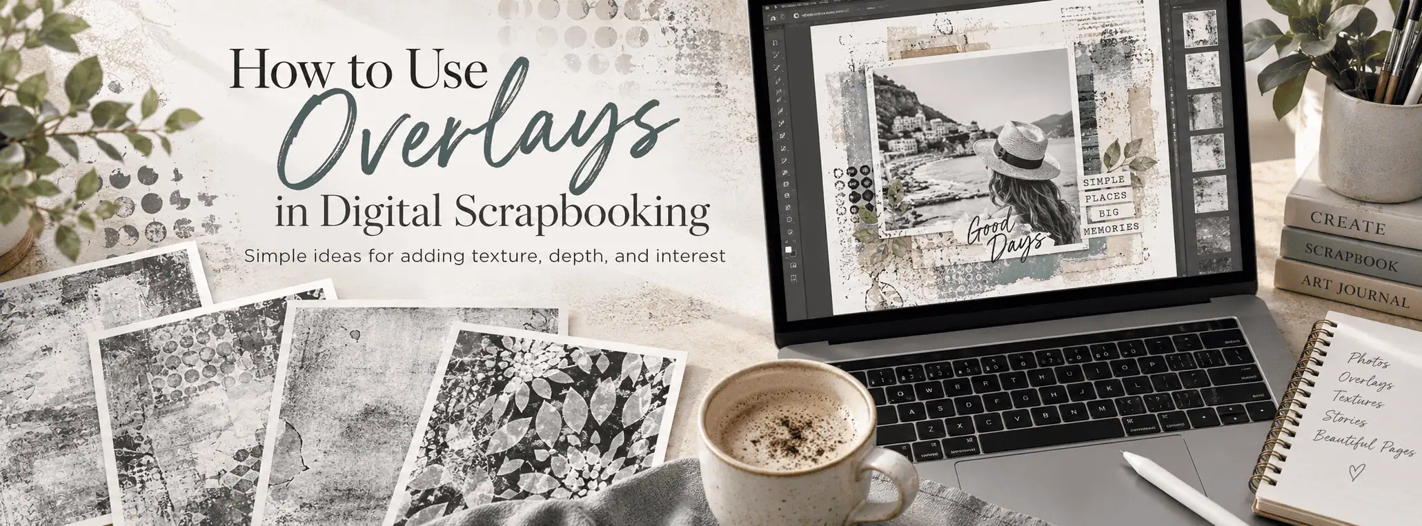
So What Are Texture Overlays?
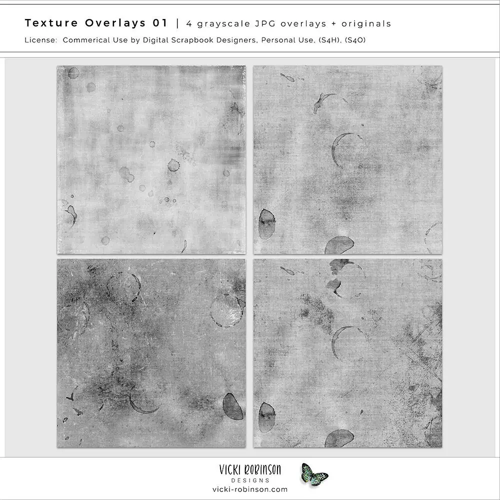
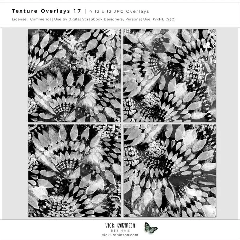
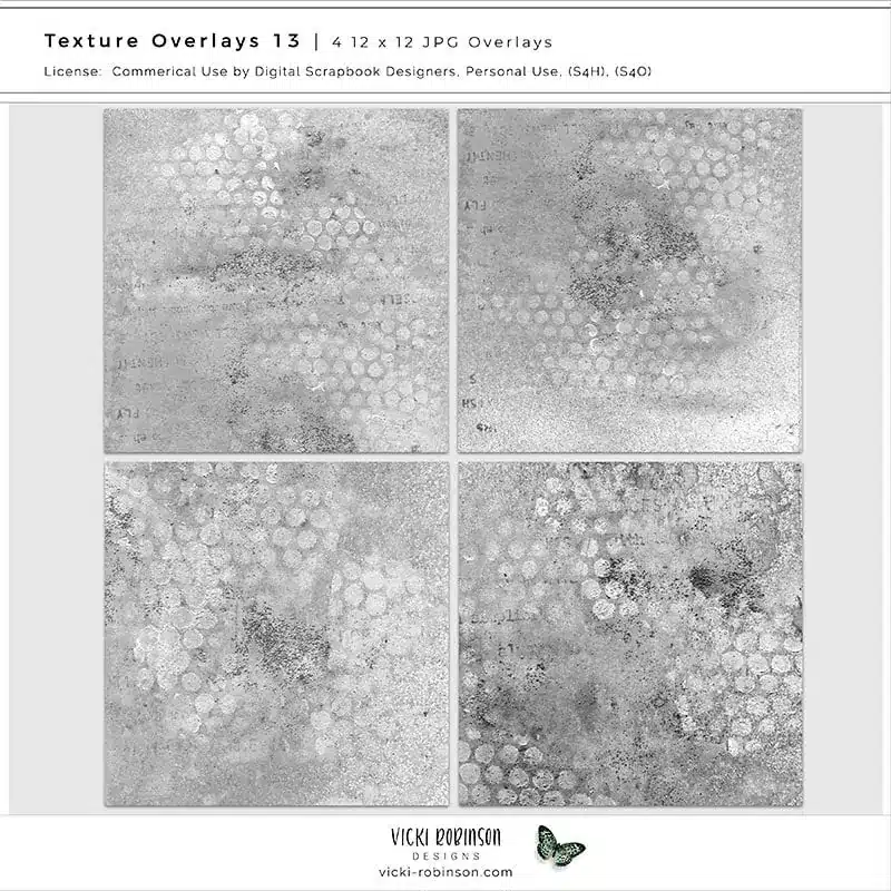
A texture overlay is a flat image file — usually a 12×12 JPG — designed to be layered on top of other elements in your layout. They come in grayscale or black and white, and they work their magic through blend modes in your photo editing software (Photoshop, Photoshop Elements, Affinity Photo, etc.).
Think of them like a sheet of textured glass you lay over your page. The texture shows through without hiding what’s underneath.
How Do I Use Texture Overlays in Digital Scrapbooking?
If you’ve ever seen a gorgeous digital scrapbook page with that perfectly aged, textured, artsy look and wondered how did they do that? — chances are, the answer is overlays. They’re one of the simplest tools in your digital scrapbooking toolkit, and once you try them, you’ll wonder how you ever scrapped without them.
In short: you place an overlay on top of your paper, photo, or layout, change the blend mode, and instantly add depth, texture, and visual interest. That’s it. No advanced skills required.
How to Use Them: The Basics
- Open your scrapbook layout or paper in your editing software.
- Drag the overlay file onto your layout as a new layer — place it above whatever you want to texture.
- Change the blend mode. Start with Soft Light or Overlay — these are the two most popular and usually give the best results right away.
- Adjust the opacity. Slide it down for a subtle effect or keep it high for maximum drama.
That’s the foundation. Four steps and you’re done.
Five Ways to Use Texture Overlays in Your Layouts
1. Add Depth to Solid or Plain Papers
Have a paper that feels a little flat? Drop an overlay on top, set it to Soft Light, and suddenly it has dimension and character. This works especially well with light or pastel papers.
2. Age or Distress a Layout
Want a vintage or grungy feel? Overlays with stains, scratches, or worn edges give your page an instant aged look. Try the Multiply blend mode for this — it deepens the darks and keeps the texture moody.
3. Create a Mixed-Media Feel
Layer two or three different overlays at low opacity for a collaged, art-journal vibe. Mix a subtle grunge texture with a bolder pattern overlay and experiment with different blend modes on each layer.
4. Add Texture to Photos
Place an overlay directly over a photo and use Soft Light or Overlay at a low opacity (20–40%). It adds a fine-art quality without overwhelming the image. Great for heritage layouts or artistic portraits.
5. Unify a Busy Layout
If your page has a lot going on — multiple papers, photos, elements — placing a single overlay across the entire layout at low opacity ties everything together visually. It’s like a unifying filter for your whole page.
Quick Blend Mode Cheat Sheet
- Soft Light — gentle, natural texture. Your go-to starting point.
- Overlay — stronger contrast and more punch than Soft Light.
- Multiply — darkens everything; great for grunge and vintage effects.
- Screen — lightens everything; nice for adding a hazy, dreamy feel.
- Hard Light — bold and dramatic. Use with lower opacity.
Pro Tips
- You can rotate or flip an overlay to get a different look from the same file.
- Stack two overlays from different sets for a completely custom texture.
- Use the eraser tool or a layer mask to remove the overlay from specific areas, like over a face in a photo.
- Don’t limit overlays to papers — try them over your entire finished layout as the very last layer. It adds a cohesive, gallery-worthy finish to the whole page.
- Check out these tips to colorize textured overlays.
Ready to Try Texture Overlays?
Texture overlays are one of those products that seem mysterious until you try them once — then they become a staple. Grab a set, experiment with blend modes, and watch your layouts transform.
Browse my full collection of texture overlays — from subtle grunge to bold mixed-media textures.

Get a Little Inspiration in Your Inbox
Ideas, gentle prompts, and new tutorials — sent to you a few times a month. No pressure, no perfection required.
0 Comments